
Angeles Wellness
Angeles Wellness project overview
This case study documents strategy, identity, and execution decisions for Angeles Wellness. The project includes category definition, brand system development, and cross-channel implementation so the final output works in real operational contexts, not only presentation settings.
Core constraints considered in this work include market positioning, audience expectations, timing, launch readiness, and consistency across digital and physical touchpoints. The outcome is assessed by clarity, recognition, and the ability of internal teams to maintain quality as the brand scales.
Deliverables may include identity rules, packaging systems, art direction frameworks, website components, and rollout guidance. Each element is connected to one strategic point of view so messaging, visuals, and interaction behavior stay coherent after launch. This page is intended to show not only final artifacts, but how the system supports decision-making over time.
In practical terms, this means the project is reviewed beyond aesthetics: does the system create faster decisions, clearer communication, and fewer brand inconsistencies across teams? Strong case studies should answer those questions with evidence from implementation, not just presentation. This documentation is structured to help founders, operators, and marketing leads evaluate that standard directly.
This page is structured as an implementation record, not only a gallery. It documents how brand thinking translated into practical outputs teams can use every day: clearer hierarchy in messaging, stronger recognition across channels, and systems that reduce fragmentation between marketing, product, and operational touchpoints. The intent is to show durability, not one-time polish, so decision-makers can evaluate whether the work will hold once the brand scales across new contexts.
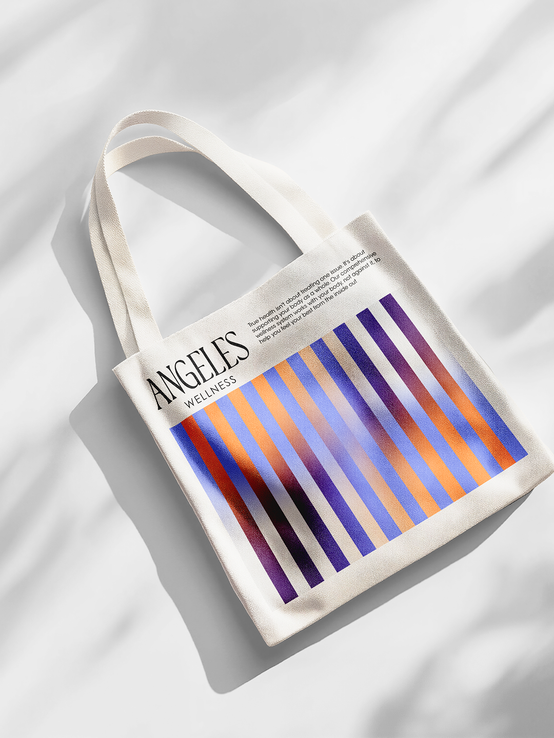
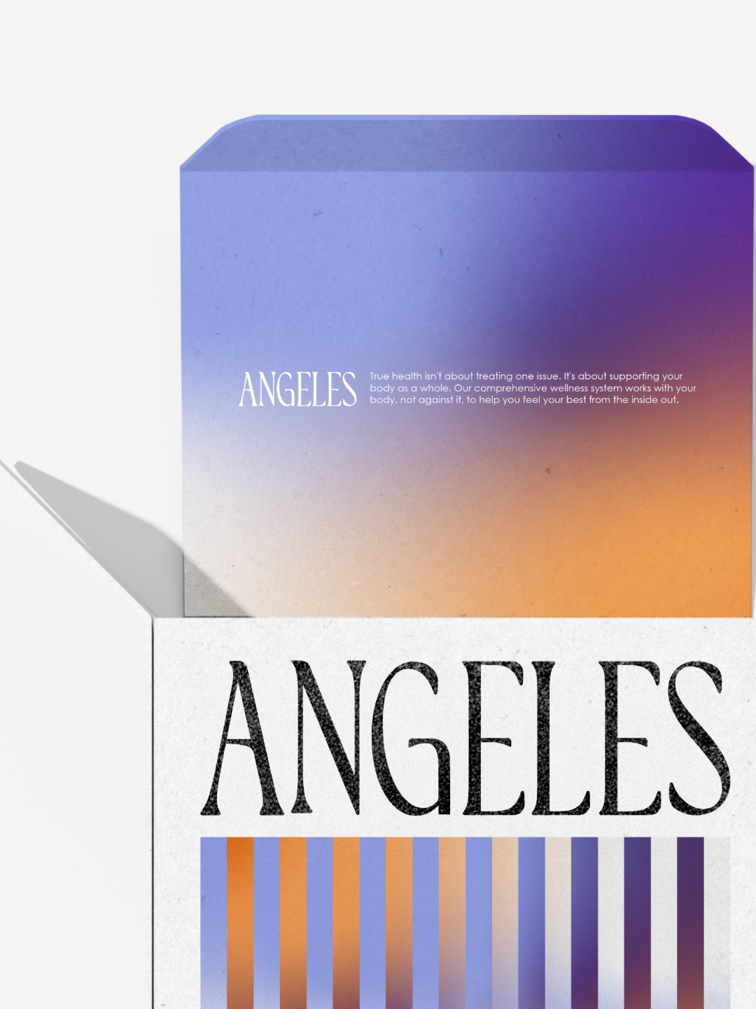
Wellness has a rhythm. So does this brand.
America
2026
( case study )
Ángeles Wellness was built to feel elevated, fresh, and easy to integrate into everyday life.
The challenge was to create a system that connects each product to the moment of the day it belongs to, without losing simplicity or elegance.
We developed a gradient system inspired by the natural rhythm of the body. Blue marks the beginning of the day and daily energy. Orange reflects balance and digestion through the afternoon. Purple signals rest, restoration, and nighttime care.
Each color becomes a cue. A moment. A function.
The custom wordmark follows the same philosophy, with soft, fluid lines that reflect purity, calm, and natural flow.
The result is a minimal yet premium identity where color, time, and wellness move together.
Region
America
( other works )
Explore related case studies with similar categories, timelines, or brand-building challenges.

